• Welcome to The Building Code Forum

    Your premier resource for building code knowledge.

    This forum remains free to the public thanks to the generous support of our Sawhorse Members and Corporate Sponsors. Their contributions help keep this community thriving and accessible.

    Want enhanced access to expert discussions and exclusive features? Learn more about the benefits here.

    Ready to upgrade? Log in and upgrade now.

2024 I-Codes?

Yankee Chronicler

REGISTERED
Joined
Oct 17, 2023
Messages
3,523
Location
New England
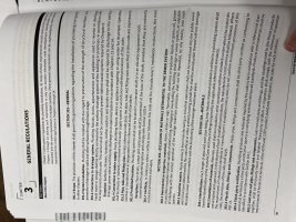
I'm reminded that the ICC has reportedly changed the entire interior formatting for the I-Code books with the 2024 editions. I'm waiting to buy anything until my state had adopted the 2024 codes, so I can get the state-specific versions. In the meantime, as a self-published author I'm always interested in the actual formatting/layout of books. Does anyone have a PDF of any of the 2024 I-Codes that they could extract just a couple of sample pages from and send them to me? Or a printed copy from which you could scan a couple of pages.

TIA
 
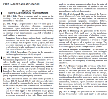
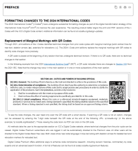
I don't have the 2024 in print yet. But, YES, it is a complete reformat, done to align the print versions to the online versions. The following except from the 2021 is what we are accustomed to from 2021, then the same section as presented in the preface to the 2024 version outlining the new format.

I'm not sure I will get the print version. My company provides us with the ICC premium so they don't have to buy a thousand books. I am an old school book guy, so it is different. I like having multiple books open, easily referencing and cross referencing between versions and other codes. Now I have to toggle between online books which is clunky to me, but it is what it is. If I get the print versions it might be on my own dime. However, as I recently moved and had to pack everything, the stacks of books made me wonder if I needed to continue down the luddite path.

1753957320588.png1753957239773.png
 
It's going to take my poor, tired brain a while to adapt to a totally new look after twenty-plus years of two columns in Times New Roman.

Still 8-1/2 x 11 pages? What are the margins? Can you decipher what type face and font sizes they're using? My inner book designer needs to know. And, like you (Sifu), I prefer books. And that's going to be my problem. After nearly twenty-five years of reading the codes in two columns of Times New Roman 10-point, a lot of things become more or less implanted. With a totally new format, that's not going to work any more. It's definitely going to slow me down when I have to look things up. The question is how long it will take me to get back up to speed.
 
For how important our jobs are it's good for us to have the information we need in the format we like. I'm always going to be a print user. Some of my staff like the digital versions, so I get them access, and I occasionally use the digital format too. But 9 times out of 10, I get up and grab the book. Each have their advantage, and you get used to a particular format. If nothing else, getting up 20-30 times a day is good for my health. And I spend too much time staring at a screen as it is...
 
The format change is extreme enough to drive me straight to full digital access instead of hard copies. I like having a book in my hand, but I remember where code sections are by how the pages look. I can re-learn them every code cycle pretty easily when the format is the same, but now it's so different that it is actually easier for me to learn the digital format.

Annoys me every time I pick up the new books.

Also, they moved a whole bunch of sections in chapter 3 of the IRC. You might think you know where stuff is... but you don't.
 
The format change is extreme enough to drive me straight to full digital access instead of hard copies. I like having a book in my hand, but I remember where code sections are by how the pages look. I can re-learn them every code cycle pretty easily when the format is the same, but now it's so different that it is actually easier for me to learn the digital format.
This is my concern.
 
The format change is extreme enough to drive me straight to full digital access instead of hard copies. I like having a book in my hand, but I remember where code sections are by how the pages look. I can re-learn them every code cycle pretty easily when the format is the same, but now it's so different that it is actually easier for me to learn the digital format.

Annoys me every time I pick up the new books.

Also, they moved a whole bunch of sections in chapter 3 of the IRC. You might think you know where stuff is... but you don't.
I too remember things based on page, position, even thickness of the pages in between the front and back. The new books will be very hard for me, will slow me down. Not sure which will be slower, finding what I need in a whole new book, or switching to and from in the digital format. Either way, it will take some getting used to. Honestly hope to be gone from the game before too much works gets done out of the '24 and beyond.
 
It's going to take my poor, tired brain a while to adapt to a totally new look after twenty-plus years of two columns in Times New Roman.

Still 8-1/2 x 11 pages? What are the margins? Can you decipher what type face and font sizes they're using? My inner book designer needs to know. And, like you (Sifu), I prefer books. And that's going to be my problem. After nearly twenty-five years of reading the codes in two columns of Times New Roman 10-point, a lot of things become more or less implanted. With a totally new format, that's not going to work any more. It's definitely going to slow me down when I have to look things up. The question is how long it will take me to get back up to speed.
The font is all driven by what's best for people with vision problems. ICC seems to have added staff for these issues. Was discussed in a recent committee meeting. I believe font is Verdana which looks like Arial to me. Can't speak to size of print version.
 
Last edited:
The font is all driven by what's best for people with vision problems. ICC seems to have added staff for these issues. Was discussed in a recent committee meeting. I believe font is Veterana which looks like Arial to me. Can't speak to size of print version.

Hmmm ...

Decades -- if not hundreds of years -- of typography studies have shown that serif typefaces are easier to read in body text than sans serif typefaces, but in the 21st century the ICC has decided that they know better. Okay, then. I think what this really means is that sans serif typefaces work better on computer screens, and the ICC (like the entire world) is pushing people to "go digital," so they picked a screen font and gave the finger to those of us who prefer printed books. And, of course, it's just not possible to use one typeface in the books and a different typeface on screen.

I have never heard of a font named Veterana and I can't find any reference to one, anywhere. The font appears to be (or is very similar to) one called Source Sans Pro. That's one I'm not familiar with and have never used, but it's better than Calibri.
My typo - Verdana - corrected. I have no dog i'm this hunt - just reporting what was presented to the committee.

Cutting and pasting from the ICC codes on line it tells me the font is Source Sans Pro.

I haven't seen a hardcopy in several editions actually.
 
Back
Top