-
Welcome to The Building Code Forum
Your premier resource for building code knowledge.
This forum remains free to the public thanks to the generous support of our Sawhorse Members and Corporate Sponsors. Their contributions help keep this community thriving and accessible.
Want enhanced access to expert discussions and exclusive features? Learn more about the benefits here.
Ready to upgrade? Log in and upgrade now.
You are using an out of date browser. It may not display this or other websites correctly.
You should upgrade or use an alternative browser.
You should upgrade or use an alternative browser.
Logo Changes Revisited
- Thread starter jar546
- Start date
Msradell
SAWHORSE
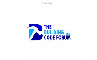
I like the top left, it's got interesting graphics as well as the Req information. I would probably make .com text larger.
chris kennedy
ADMIN
No, it looks like
The building.com
A code forum
The building.com
A code forum
Yankee Chronicler
REGISTERED
No, it looks like
The building.com
A code forum
I agree.
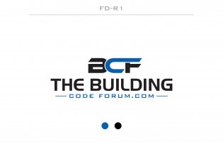
That comment applies to the first two. The third IMHO completely misses the mark. First, the top line acronym omits the 'T'. The web address isn'y www[dot]buildingcode forum.come, it's www[dot]THEbuildingcode forum.com. So the acronym in the first line should be TBCF.
Below that, it looks like the name of the entity is just "THE BUILDING," and "code forum[dot]com" is an afterthought.
jar546
CBO
Great feedback. Keep the comments coming.
TheCommish
SAWHORSE
I don't need the .com
jar546
CBO
It was requested by others and others don't like it. I am in a lose/lose situation.I don't need the .com
TheCommish
SAWHORSE
i would keep it small to prevent perceptions of the address being "thebuilding.com"
or buy the address "thebuilding.com" if available and forward it
or buy the address "thebuilding.com" if available and forward it
jar546
CBO
I asked for some help. This is the breakdown.
Ultimately, the choice should reflect the forum's identity and how you wish to be perceived by both current members and potential new ones. If I had to choose based on the current designs and the information provided, I would lean towards a revised version of Logo 3 (FD-R1), emphasizing construction imagery a bit more while keeping the modern and simple design. This approach could help balance immediate relevance with future-proofing.
Logo 1 (AA-04)
Pros:- The use of a protective helmet in the iconography is immediately associated with construction and safety, which is relevant for a building code forum.
- The typography is clear and modern, which can be good for readability.
- The color contrast is strong, making it stand out.
- The graphic element might be too detailed for smaller scales, potentially losing clarity when the logo is reduced in size.
- The inclusion of ".com" makes it specific to the website, which may limit the use of the logo if the forum expands beyond the website.
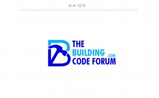
Logo 2 (AA-05)
Pros:- The stylized "B" in the icon can be seen as representing both a building structure and a book or document, symbolizing the code or standards.
- The color scheme is consistent with the first, maintaining brand color continuity.
- The icon is simpler than the first, which could potentially scale better at smaller sizes.
- The resemblance of the "B" to a heart shape might be misleading as it doesn't directly relate to building or codes.
- Similar to the first logo, the ".com" can be restrictive.
Logo 3 (FD-R1)
Pros:- The acronym "BCF" is very compact and would scale well across various media.
- The design is the most minimalistic and modern of the three, which can often be more future-proof.
- The separation of "Building Code Forum" from the ".com" allows for the name to stand alone without being tied to the web address.
- The design might be too abstract and doesn't immediately suggest building, construction, or codes.
- The split between the "BCF" and the full name may cause a disconnect in brand recognition.
Suggestions for Improvement:
- Consider the importance of the ".com" in the logo. If the forum has a strong online presence and you want to emphasize the website, it might be useful. However, if the forum is known by its name alone and may expand beyond a website, it might be more strategic to drop the ".com" for versatility.
- Think about the scalability of the logo. A simpler design tends to be more versatile across various applications, from mobile screens to large banners.
- Reflect on the recognizability of the logo elements and what they convey. Ensure that the graphic elements are directly related to building codes and forum discussions.
Ultimately, the choice should reflect the forum's identity and how you wish to be perceived by both current members and potential new ones. If I had to choose based on the current designs and the information provided, I would lean towards a revised version of Logo 3 (FD-R1), emphasizing construction imagery a bit more while keeping the modern and simple design. This approach could help balance immediate relevance with future-proofing.
Inspector Gadget
REGISTERED
^^^^Lose the .com.
This.
Paul Sweet
SAWHORSE
AA-04 without the .com. Everybody recognizes a hammer as being used (or misused) in building construction.
The full site name with .com could be written underneath in a small font below in those few instances where it would clarify that it is all one word.
The full site name with .com could be written underneath in a small font below in those few instances where it would clarify that it is all one word.
steveray
SAWHORSE
Dump the .com and pick whatever got the most votes...I just tell people to "google thebuildingcodeforum"
jar546
CBO
Be the dictator and toss out the election. Is there any reason that you can't have both? If you Google search "building code forum" without the the in front, this forum comes up.
jar546
CBO
I paid for 6 concepts, limited revisions and 1 choice. The people have spoken. It's done.Be the dictator and toss out the election. Is there any reason that you can't have both? If you Google search "building code forum" without the the in front, this forum comes up.
TheCommish
SAWHORSE
I will pay for oneI paid for 6 concepts, limited revisions and 1 choice. The people have spoken. It's done.
jar546
CBO
Thank you but this has gone on long enough and I need to bring this to a close. The order was sent for the final choice based on the wishes of the forum.I will pay for one
Not sure if you noticed but the shape of the hammer is for a cobbler’s hammer. Not that I am criticizing, I just thought that you might want to know.
Inspector Gadget
REGISTERED
Given that most of us obtain income from dealing with people who cobble crap together, that's quietly fitting.Not sure if you noticed but the shape of the hammer is for a cobbler’s hammer. Not that I am criticizing, I just thought that you might want to know.
TheCommish
SAWHORSE
Not a comment, a request to buy one of the first capsThank you but this has gone on long enough and I need to bring this to a close. The order was sent for the final choice based on the wishes of the forum.
What size head do you have? In my case XX-large probably cost more!Not a comment, a request to buy one of the first caps


