• Welcome to The Building Code Forum

    Your premier resource for building code knowledge.

    This forum remains free to the public thanks to the generous support of our Sawhorse Members and Corporate Sponsors. Their contributions help keep this community thriving and accessible.

    Want enhanced access to expert discussions and exclusive features? Learn more about the benefits here.

    Ready to upgrade? Log in and upgrade now.

Have a coke

Mr. Inspector

SAWHORSE
Joined
Nov 28, 2009
Messages
4,693
Location
Poconos/eastern PA
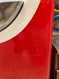
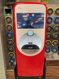
Doing a final accessibility inspection at a Wawa. At first I was going to fail this vending machine because all of the buttons were too high. Then manager showed me these almost invisible buttons on the 2nd photo. You can hardly see them unless you get close and look for them but you can feel them and they are less then 48" above the floor. They do anything the other buttons do. Does this meet IBC chapter 11 and ANSI??

1.jpg above the floor
2.jpg
 
I would say yes... only I believe that the accessible use symbols should be in a contrasting color.

A117.1-2009
703.2.10 Finish and Contrast

Characters and their background shall have a non-glare finish. Characters shall contrast with their background, with either light characters on a dark background, or dark characters on a light background.
 
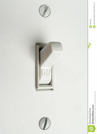
That section is under signs. I do not think I can call these controls signs. No more than a white light switch with on and off on it on a white wall. But it seems that their should be something in the code about it.

1617885352467.png
 
We have had similar conversations before

 
Back
Top